If you stare at any two datasets long enough, you can convince yourself there’s a connection between them. Not because there is, but because there is an important enough question that the data “should” be connected. It’s a dangerous place from which to start a modeling project.
This is one such story. Enter multi-instance-learning, and how I failed spectacularly even on simulated data.
Business Context
Imagine an operation where some things are measured obsessively, but others are scattered. Precise timestamps on every step of a process. How long did each phase take? Detailed duration metrics on every transaction, high volumes every day.
Separately, you run satisfaction surveys. Happy people interacting with your operation isn’t just a people thing. If you have a reputation for wasting someone’s time, you’re going to quickly find yourself paying more for the privilege. Making your operation a place people want to come is as good people sense as it is business.
Not everyone takes the survey. It’s voluntary, and the responses come in throughout the day, timestamped but not tied to any specific transaction. Someone fills one in right after their interaction, and someone else two hours later, or the next morning. You don’t know which transaction prompted the response.
In this scenario, we wouldn’t want to know what specific transaction prompted that response, and that isn’t important. We would like to know what conditions prompted it. If you found out that for whatever reason blue paint in the waiting room made people happy? Then blue paint it would be.
The question I was wanting to answer: can we link those two data sources? If we could add contextual information to the survey, we could identify the operational metrics that actually matter to the people filling them out. Instead of guessing that long wait times hurt satisfaction, we’d have data. We could focus on the metrics that matter and surface them in operational dashboards, and have a balanced scorecard approach.
I decided to throw a neural network at it. This is the story of why that was the wrong tool for the job.
The Architecture
The problem breaks down into two pieces you have to solve at once. You get a survey with a timestamp and a score, and somewhere in the hours before that survey, there’s a set of transactions that could have caused it. Which one was it? And what about that transaction made them rate it the way they did? You can’t answer one without the other. To learn what drives bad scores you need to know which transaction provoked it, but to know which transaction to look at you need to know what bad scores look like. Chicken and egg.
I went at this two ways. First attempt was two networks trained together. One network looks at all the candidate transactions in a time window and assigns probability weights to each one, like saying “I think it was 60% likely to be transaction #47 and 25% likely to be transaction #52.” The other network takes a transaction’s duration metrics and tries to predict the survey score. They share a loss function, so when the score predictor gets it wrong, that error signal also teaches the matcher to pick better candidates next time.
Second attempt used something called Multiple Instance Learning, where you treat all the candidate transactions as a bag. Instead of picking one candidate, the model weighs the whole set, builds a blended representation, and predicts the score from that. More mathematically principled for this kind of “I don’t know which item in the group is the important one” problem.
Both are reasonable approaches. Neither was why things went sideways.
The Synthetic Proof-of-Concept
The exercise was built on proving out whether this could extract the signal from the noise when I knew there was a signal. I built a synthetic dataset with a known ground truth. 1,000 transactions, 200 surveys, a 30-minute candidate window. The scoring rule was deterministic: start at score 5, subtract points if any of four duration metrics exceeded their thresholds, floor at 1.
Each survey was generated by randomly selecting a transaction and adding 2-30 minutes of delay. So I knew exactly which transaction caused each survey and I knew the exact formula that produced each score. No noise. No ambiguity. A few candidates per survey because the window was tight. If the model couldn’t crack this, it couldn’t crack anything.
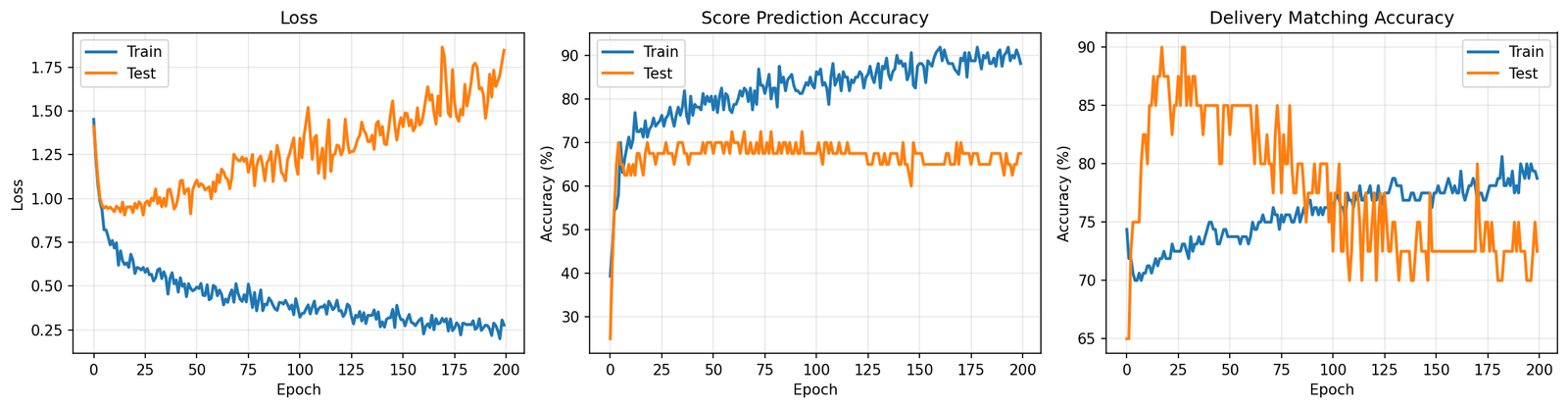
It got 85% of scores right and matched the correct transaction 80% of the time. Sounds decent until you remember this is a cheat sheet test. The formula is deterministic and there are maybe 4 candidates to pick from. Missing 15% of scores on that is not great. I looked at the training curves and it was classic overfitting. Train set accuracy going up, test set stuck and jittering around 75%. The model was fitting to the training examples rather than learning the pattern.
That was the first red flag and I mostly ignored it.
Scaling Up and Falling Apart
I then tried to make the data look more like what you’d actually face in practice. Scaled to 10,000 transactions and 5,000 surveys. Widened the candidate window to 600 minutes. In practice, people don’t fill in surveys within 30 minutes. They do it hours later, sometimes the next day. A 600-minute window gave me about 40 candidates per survey instead of 4.
Results: 35.9% score prediction accuracy, 2.7% transaction matching.
Five score categories means guessing randomly gets you 20%. We barely beat random on scores. And 2.7% matching against 40 candidates is literally what you’d get from a coin flip (random chance is 2.5%). The model trained for 200 epochs and came out the other side knowing nothing it didn’t know before epoch 1.
I switched to the MIL architecture. Loss went from 2.3 down to 1.6 over 65 epochs. Looks like progress on paper, but it’s a common trap: looking at loss functions and not considering what the model is actually doing with individual predictions. I pulled out the transactions the attention mechanism focused on most for each test survey and grouped them by score level.
Score 1 transactions had average durations of 10.5, 7.6, 27.1. Score 5 transactions had average durations of 11.7, 7.5, 26.5. Basically the same numbers. The attention wasn’t locking onto anything meaningful. It picked whoever was convenient, and the score predictor just learned to always say “about 3.5” because that minimizes your loss when you have no real information.
What I learned
Three problems killed this, but any one of them would have sufficed.
The Mechanical. The matching is looking for a needle in a haystack where all the hay looks exactly like the needle. Forty candidates in a window, all with duration metrics drawn from the same distributions. The correct transaction has no distinguishing mark. The only thing that makes it “correct” is that its durations happen to match the scoring formula, but the model doesn’t know the formula yet because that’s what it’s trying to learn. It’s stuck in a loop. You’d need something like a transaction ID on the survey, and if you had that, you wouldn’t need a model at all.
The data collection. This one took me too long to see. A person filling out a survey isn’t reacting to one interaction. They’re reacting to their morning. Their week. How things have been going in general. The whole premise of “which transaction caused this score” assumes a 1-to-1 link that doesn’t exist. In practice, the extremes (1s and 5s) tend to reflect overall sentiment or first impressions, while the middle scores (2-4) are more nuanced. The survey is a thermometer, not a receipt.
The business context. Even if you could match perfectly, a handful of duration numbers aren’t enough to explain why someone rates a 3 versus a 4. Experience depends on how people treated them, physical conditions, whether things were ready when they arrived, the weather. Duration is a proxy for some of that (long waits often signal a disorganized operation), but a rough one. Predicting 5-level satisfaction from timing features was always going to cap out.
The Actual Answer
The hypothesis behind all of this was something like: “if we reduce wait times, satisfaction goes up.” That’s a perfectly testable idea. But not with a model.
Building a neural network to reverse-engineer causality from observational data is the hard way to answer this. The easy way: pick a set of locations, implement a change at half of them, leave the rest as controls, compare survey scores three months later. If cutting time moves the average score meaningfully, there’s your answer. The question becomes quantifying the value of that improvement and whether the cost pencils out. If it doesn’t budge, that’s also useful, and a lot cheaper than training models that converge to random, or worse relying on their recommendations.
That’s the unglamorous conclusion. I spent time on attention mechanisms and MIL architectures when the right approach was a spreadsheet and a pilot program. I was trying to shortcut around the hard part (actually changing operations and measuring the result) by mining historical data for patterns that would predict the outcome. But the signal was never in the data because nobody designed the data collection to put it there. Surveys and transactions are two streams that happen to coexist in time. No amount of matrix multiplication will manufacture a causal link the measurement system never established.
Sometimes you just have to run the experiment. Change the process and see what happens. No model required.
Leave a Reply